Latest images
1 Forumotion Review Sun Jun 05, 2011 7:23 pm
Thomas
Admin

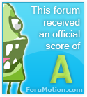
We got an A on the review how great

Computer Talks
 First Impressions - Rating: Excellent
 Graphics & Layout - Rating: Good
Computer Talks
First Impressions - Rating: Excellent- This is the first time I've given an excellent rating for a forum in a while so this is great! There are a few minor fixes that can be done on first impression such as moving the banner down, or using a different background color other than the greenish blue color where the navigation bar is placed; aswell as adding a box around the username and password text areas because right now they're just a line. I think you should make the +/- either bigger, white, or bold so that people can see it better on the blue background. I think that there could also be more space on the post icons for your legend at the bottom of the forum. What I like the most is that you've taken advantage of all the tutorials of the support forum and used them to your advantage. Saying this, there are alot of forums that do the same so you may not be as unique in that realm, for example your register banner in the top right of the forum, Iv'e seen this a few times before, so this can affet you in a negative way. It's good to have one but I think that you could probably use a customized image to make it look better. I also don't like that you've used 99 hours for the look back, it makes it have a random number and it doesn't look like. I'd say to use 48 to 72 tops.
Graphics & Layout - Rating: Good- Starting with your banner there are few things that you can fix, I think that you could overlay the navigation bar onto the banner so that you eliminate that green space, or you can make it white so that the navigation abr is on a white space. I also think that the YouTube, Facebook, and Twitter icons could be imagemapped so that they look link to your actual youtube facebook and twitter pages, I tried to click on them and it just bought me back to the forum, having direct links would make it better. I think you could add some kind of image overlay to the navigation bar so that when you hover on it it will have a different background image. I also think that you could space the buttons further appart so they're not all squished together. I like that you've installed a toolbar at the bottom, it makes your forum better, but it is a free bar that has a logo on it. I think that you should minimize the amount of topic icons, because there is a closed and locked one which can be confusing; and last but not least; you should space out the legend for post icons more if you can